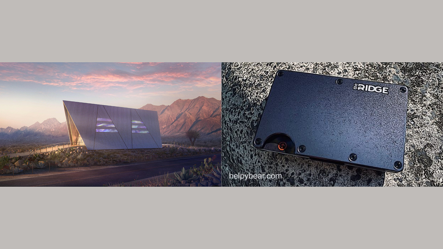
Why Does This Look Like A Walkman???
The advanced nuclear sector just won a couple billion from the Biden infrastructure deal—can they please use some of it to fix their horrible aesthetics?

I’m truly happy the Biden infrastructure plan will have money for advanced nuclear research. I want nuclear to continue to be a space where we push ourselves to excel and create beautiful, virtuous things. And that’s why I hope advanced nuclear companies and their boosters take this as an opportunity to try making design mock-ups that don’t look like a focus group of computer game NPCs from 1998 rendered them.
I get that these representations have more advertising purposes than anything. But that doesn’t excuse them. In fact, their nature as advertisements offers a better vantage by which we can understand what’s wrong. These design elements don’t arrive in a vacuum and their problems are not unique to the advanced nuclear space.
To lay bare what’s happening, I want to look at two dominant aesthetic strategies: minimalism and smoothness.
Today, we look over our shoulder at the twentieth century, especially its middle decades, as years of plentifulness, coherence, and togetherness. Surely, to hold happy historical memories of the impressive feats and inspiring moments from that era behooves us. But to remember them so differently from how they were experienced entraps us in nostalgia rather than memory. In truth, extremity and alienation defined the era as well.
The Holocaust, Hiroshima and Nagasaki, and the American interventions in both Korea and Vietnam, terrible in themselves, arrived in American living rooms through an overwhelming diffusion of images. And for artists of all stripes, this diffusion assaulted their vocation. Christopher Lasch called this problem the Roth-Cunningham Effect, named for author Philip Roth and dancer Merce Cunningham.
Roth, in the sixties, said that the writer’s imagination struggles in the face of an “actuality” that “is continually outdoing our talents.” Cunningham, a decade earlier, noticed that the sense of permanent crisis cataloged by the headlines created feelings of numbness and discontinuity in which “each thing can be and is separate from each and every other.” This posed difficulties for Western art’s traditional reliance on tension and climax.
In response, artists took on a survival strategy of effacement the personality of the artist, the rejection of “clarifying context,” the disconnection of objects and events, the stark refusal to find patterns and thus meaning, opting instead to insistence on the “random quality of experience.” A world of surfaces, a kind of anti-depth that troubled the firmament between the self and the world.
It’s helpful to contemplate an example. Frederic Jameson suggests comparing Van Gogh’s painting of peasant shoes with Warhol’s “Diamond Dust Shoes” as a way to recognize the passage to post-modern minimalism.
Jameson notes that the vivaciousness of Van Gogh’s painting invites us to consider the hard, stark poverty of farm life and a Utopian realm of the senses to compensate for the capital’s demands on the body. On the other hand, it could also offer the viewer what Heidegger saw:
In [the shoes] there vibrates the silent call of the earth, its quiet gift of ripening corn and its enigmatic self-refusal in the fallow desolation of the wintry field […] This equipment belongs to the earth and it is protected in the world of the peasant woman […] Van Gogh’s painting is the disclosure of what the equipment, the pair of peasant shoes, is in truth.
Whichever view we take, Warhol’s painting offers us neither vantage. The shoes are flattened and, in person, retain a sheen that shimmers. They appear as but a collection of objects to potentially be advertised (Jameson reminds us that Warhol got his start in drawing shoe advertisements), and they might ominously refer to the shoes piled in the corners of concentration camps if it weren’t for their absolute lack of context and their superficial exuberance. They suggest neither a synecdoche of social relations nor the ecstatic disclosure of our lifeworld. Instead, we’re given a bubbly but menacing nothingness.
It’s been forty years since Warhol painted “Diamond Dust Shoes.” In the interim, a lot has happened. But the prevailing social and aesthetic concerns have endured even if in permutated fashion.
If the latter half of the twentieth century found itself aesthetically concerned with kinetic entropy—large-scale disaster, industrial cataclysms, mechanized warfare—the opening decades of the twenty-first have increasingly homed in on psychic entropy. We worry now over information virology, black box algorithms, and the atomized yet parasocially intimate world of digital life.
The ambivalence and anxiety with which we great our media-saturated society. The minimalism has stayed with us has remained common. But its reductionism has taken on a new accent: smoothness.1 Korean- German philosopher Byung-Chul Han writes that smoothness is the “signature of our times.” He describes smoothness’s essential qualities as adaptability, “absence of resistance,” and a “pure positivity, in which there is no pain, no injury, and no guilt.”
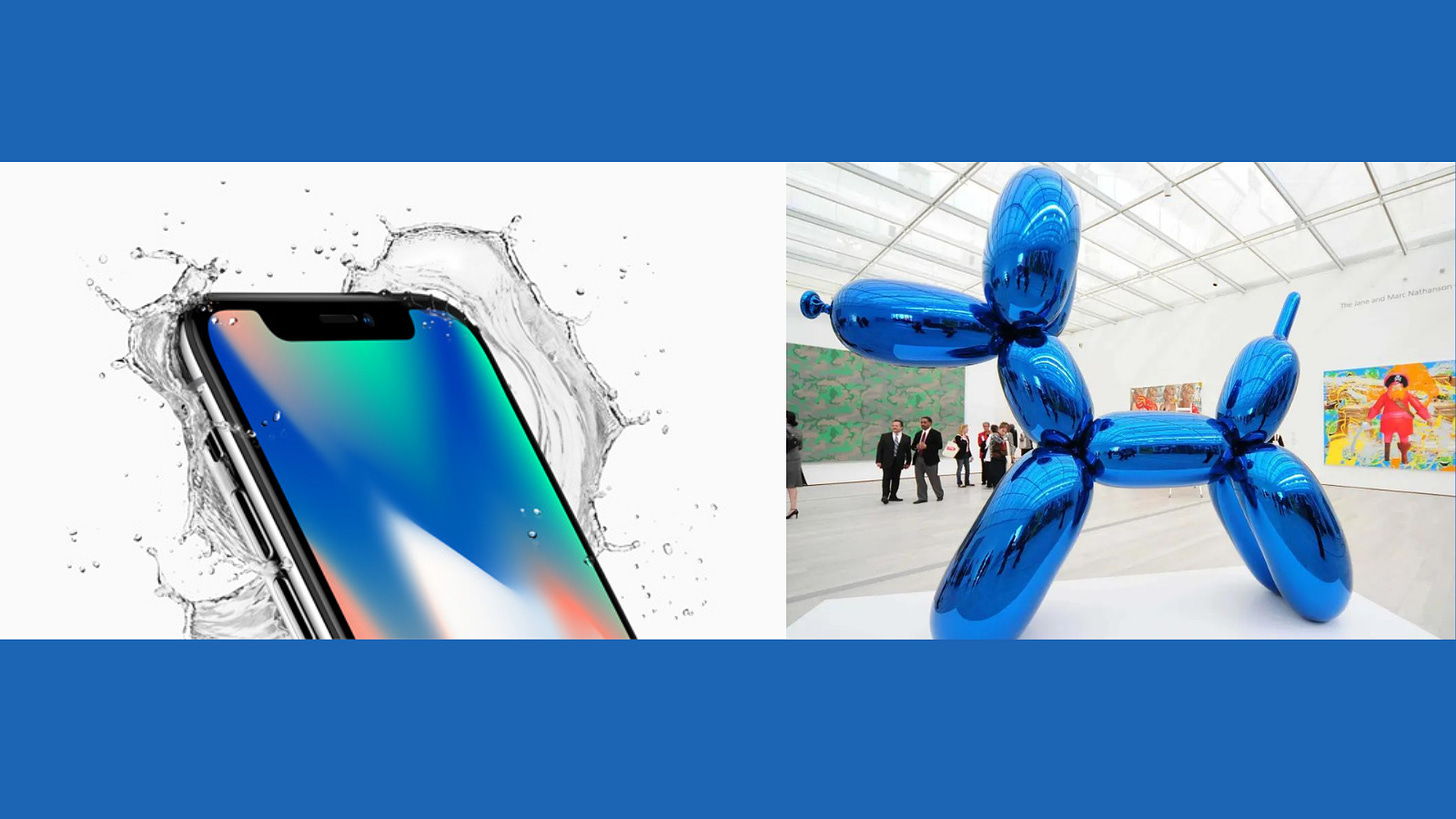
For Han, the artist Jeff Koons stand as the artist of our present zeitgeist. Koons makes huge sculptures of smooth objects like balloon animals. Jeff Koons said of “Balloon Dog”:
“The Balloon Dog” is really a wonderful object. It wants to confirm the observer in their existence. I often work with reflecting, mirroring material because their automatically raise the self-confidence of the viewer […] if you stand right in front of the object, you are reflected in it and assured of yourself.
Han points out that Koons aims to remove sensations of distance, difficulty, and provocation. He invites the viewer to escape the chaos of the world through uplift and reduction. But Koons’s work achieves the opposite effect. It appears unintentionally alienating rather than self-assuring. Works like “Balloon Dog” feel as if an enormous, mechanical child made them. Or as if they were plucked from a painfully bright stock photo and dipped in liquid mirror glass. Either way, we don’t experience our reflections in them as assuring, rather we witness a bent and distorted version of ourselves cast back to us. Koons manages to reify the not-quite-human distortion of our digital lives.
I’d be remiss if I did not mention the other captain of the smooth: Steve Jobs. Famously, Apple adopted touch screens because Jobs hated buttons. He found their friction clumsy, inelegant, ugly. And so now much of our lives transpire upon the smooth surfaces his company innovated and dispersed.
There’s an eerie similarity between the iPhone and a Koons sculpture. In both cases, these men saw themselves as providing aesthetic solutions to problems set before users and viewers as they saw them. Users needed to leave behind the tactile world of the printing press whose last iteration is the keyboard. Viewers needed self-assurance in a scattering time. Instead, the world came to be experienced as a social world rife with dynamism yet absent the friction of context and rootedness. And instead of providing assurance, they provided belittlement by and estrangement from our surroundings.
But what does all this have to do with bad advanced reactor aesthetics?
Fair question.

I mentioned Hiroshima and Nagasaki above for good reason: there’s no way to appreciate the trajectory of modernist and post-modernist art without appreciating the problem technology and its attendant catastrophes posed. Even Eisenhower was sensitive to the issue and it was out of this sensitivity that the promise of “Atoms for Peace” arose. In one of the more famous posters for the program, the hand of God emerges from a mushroom cloud, offering the atom in its open palm. We should respect the gravity of such an image.
But nuclear suffered greatly from the very fear minimalism sought to sidestep. To offer designs such as these aspires to assuage the viewer of any fears of nuclear energy. Isn’t that what people are always telling us about advanced nuclear, anyway? That it will be radically safer than the already incredibly safe existing nuclear reactors. Be that as it may, these designs cater to rather than overcome the fear of nuclear because they are cast in the aesthetic idiom of that fear. And it can’t be overstated that minimalism failed as a response because it could only reduce the artist’s role as interpreter of (and architect’s role as creator of) experience and so only offered the viewer confirmation of their worst suspicions of the world’s randomness and meaninglessness.
Similarly, whereas smoothness sought to achieve a likable, unencumbered aesthetic world, it has instead accentuated/enabled the alienating and bewildering nature of our digital-social world. When I see designs above—especially the Rolls Royce pupa reactor or the GE Hitachi diaper wipe box—I feel like I’m looking at the Koonsification of nuclear—they’re meant to mollify me but instead, they weird me out and make nuclear look like an alien technology awkwardly imposed upon society by a boardroom of cyborgs.
These are self-defeating aesthetic strategies for nuclear. So, I’d like to make a humble suggestion for how we ought to approach design.
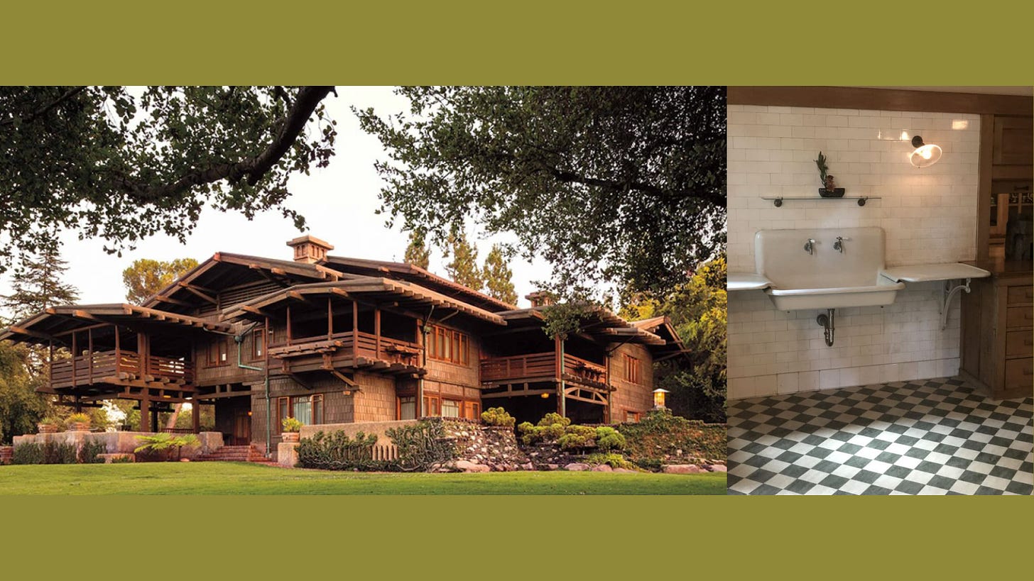
The winter before the pandemic broke out my wife and I got invited to a party in Pasadena. Friends of friends were staying at the Gamble House through some sort of grant program for aspiring architects. The Gamble House was built in the late 19th century after the Gamble family won contracts with the government to make soap and other sundries for the Union Army. The company would later become Proctor & Gamble.
It’s a beautiful and strange house whose details I can’t and won’t explore here save for this: the tile you see on the right was the same tile, our guides told us, that plated train stations in New York. The Gamble family had discovered which materials had antiseptic qualities and used them to furnish various public works. They then incorporated them into their own home as a point of pride.
I can’t help but feel that these advanced reactor designs could benefit from an inverted Gamble House method. Whereas the house took on infrastructural elements produced by the company, advanced plants should take on architectural idioms from their surrounding area. If they’re going to be built in New England, New Mexico, or anywhere else then they should reference the regional design vernacular. In other words, they should look like they belong somewhere and appear incorporated into our society as we know it.
Nuclear is a valuable—nay, essential—part of our society and so it should look like something that comes from it. We should be able to recognize nuclear plants as extensions of our own history built in the present and handed off to posterity. They are, after all, industrial cathedrals.
Smoothness as I’m going to lay it out here is not the only visual mode at hand these days. Hal Foster’s Bad New Days provides a helpful, if incomplete, overview for the curious.


I've had the same thoughts about the weird SMR industrial designs. They could make them look like a big turd and I would support their construction. On the other hand, Leonardo D. himself couldn't create a design that anti-nukes would accept. I suspect the real audience of these designs is the undecided. If built, I doubt that the enclosures will look anything like the sketches (if they are even enclosed at all).